SPC and Control Charts: A Manufacturing Leader's Guide to Process Stability
Learn how to implement Statistical Process Control (SPC) effectively, choose the right control charts, interpret signals, and use data-driven insights to maintain process stability.
John Lee
Statistical Process Control (SPC) is the backbone of manufacturing process management. It provides the scientific basis for understanding whether your processes are stable, capable, and producing consistent results. Yet many organizations struggle to implement SPC effectively, often collecting data without using it to drive decisions.
The Foundation: Understanding Variation
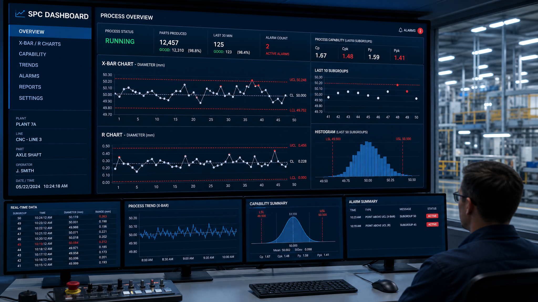
Every manufacturing process exhibits variation. SPC helps you distinguish between two types: common cause variation (inherent to the process, predictable) and special cause variation (assignable to specific events, unpredictable). Control charts are the primary tool for making this distinction.
When only common cause variation is present, the process is in statistical control — it's stable and predictable. When special causes appear, the process is unstable and requires investigation. This distinction is critical because the appropriate response differs: common cause variation requires systemic process changes, while special cause variation requires identifying and eliminating the specific cause.
Choosing the Right Control Chart
Selecting the appropriate chart depends on your data type and collection method. For variable (continuous) data, X-bar and Range charts are the workhorse of manufacturing SPC. They track both the process average and the process spread simultaneously. Use them when you can collect rational subgroups of 2 to 8 measurements.
For situations where only individual measurements are practical (expensive testing, destructive testing, or continuous process monitoring), Individual and Moving Range (I-MR) charts are appropriate.
For attribute data (pass/fail, defect counts), p-charts track the proportion of defective units, while c-charts and u-charts track the count of defects per unit.
Interpreting Control Chart Signals
Beyond the basic "point outside control limits" signal, the Western Electric rules and Nelson rules identify patterns that indicate process instability. These include runs of points on one side of the center line, trends of consistently increasing or decreasing values, points near the control limits (in the outer third), and unusual patterns like oscillation or stratification.
Each pattern suggests a different type of special cause. For example, a trend might indicate tool wear, while oscillation might suggest two different operators or material lots.
Process Capability Analysis
Once your process is in statistical control, you can assess its capability — its ability to produce parts within specification. The key metrics are Cp (potential capability, assuming the process is centered) and Cpk (actual capability, accounting for process centering).
Industry standards vary, but common targets include Cpk ≥ 1.33 for general manufacturing, Cpk ≥ 1.67 for safety-critical or automotive applications, and Cpk ≥ 2.00 for Six Sigma performance levels.
Implementing SPC Successfully
The most common SPC failure is collecting data without acting on it. Successful implementation requires clear reaction plans for out-of-control signals, trained operators who understand why they're collecting data, management commitment to investigating special causes, and regular review of SPC data in quality meetings.
Start with your most critical processes — the ones where quality problems have the greatest cost or safety impact. Demonstrate success with a pilot program before rolling out across the entire operation.
Frequently Asked Questions
What is the difference between control limits and specification limits?
Which control chart should I use for my data?
What does a Cpk of 1.33 mean?
About the Author
John Lee
Founder & Quality Systems Architect
John Lee brings over 20 years of hands-on experience in quality management across automotive, aerospace, and medical device manufacturing. As the founder of IntelligentQMS, he has helped organizations worldwide implement robust quality management systems that drive operational excellence.